
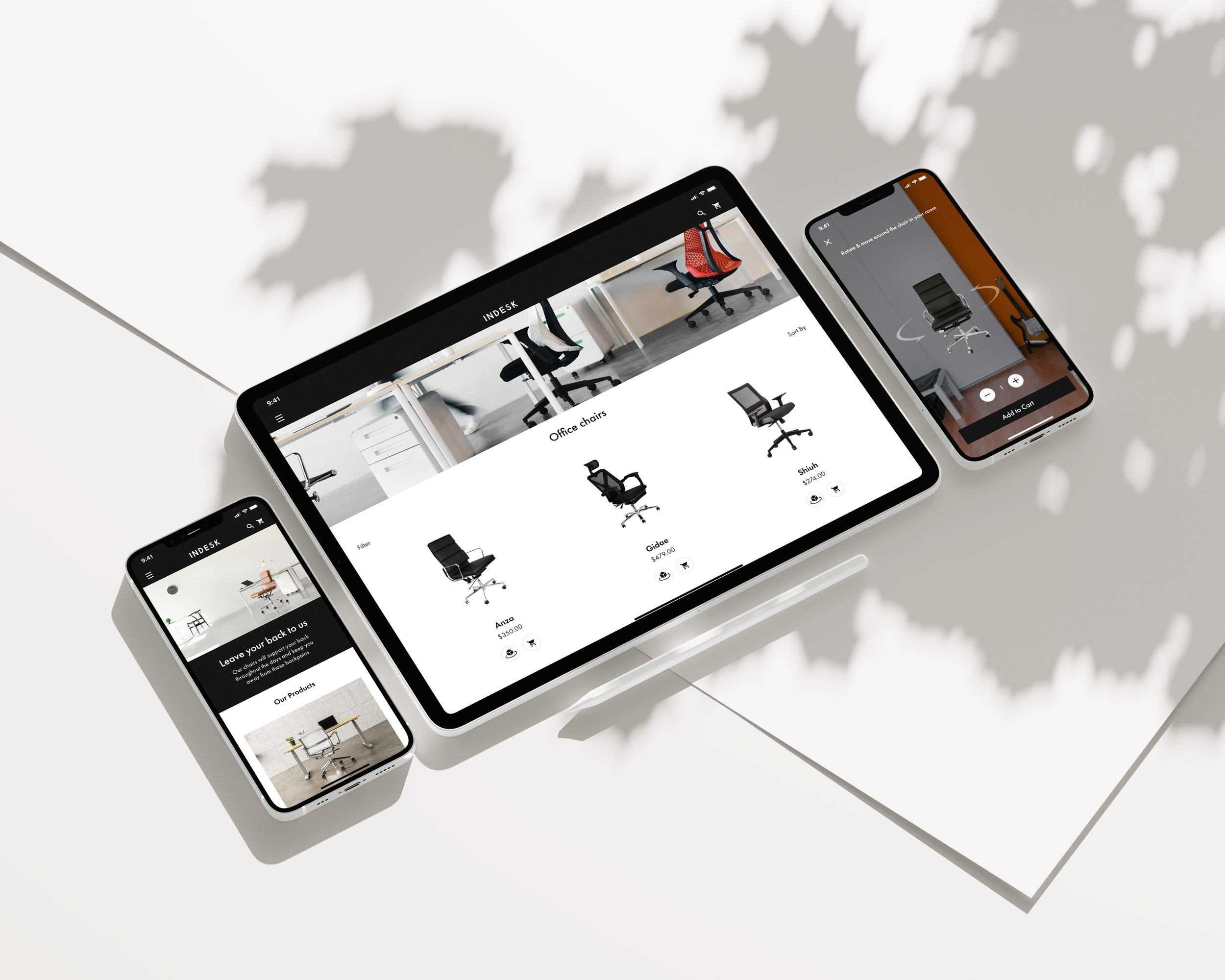
INDESK
Improving ergonomic chair website’s conversion rate by helping customers choose the “right” chair
Duration
22 Apr - 20 May 2022
Four week
Project Type
E-Commerce Scenario: Sales Conversion
My Role
Competitive Analysis
Wireframing + Prototyping
Usability Testing
Overview
INDESK is my second capstone project where I was given a scenario to enhance a chair company’s mobile-web experience and improve its usability.
In the course of four weeks, I explored the existing solutions to the company’s current problems by analyzing the competitors. The main challenge of this project was to maintain the balance between the user and business goals.
Problem
Difficult to choose the right item and checkout as a guest.
Data shared by the product manager are as follows:
50% of users abandon the site without adding any items to the cart
70% of users do not proceed to the checkout; they abandon the cart at the registration page
Goals
Business Goal
To improve the conversion rate and increase revenue on the product’s mobile-web experience.
User Goal
To find and purchase the best product (chair) that meets the criteria based on its relative features.
Solutions
01
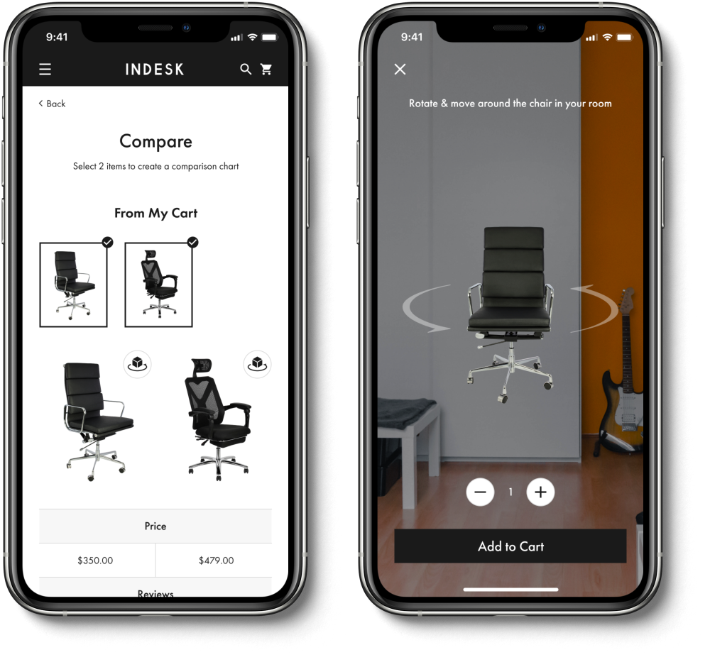
Comparison table for selected items (+ AR technology)
Reduces the stress of choosing an item for customers
Able to compare items based on multiple criteria
View In Your Room - AR feature for users who want to visualize their product
02
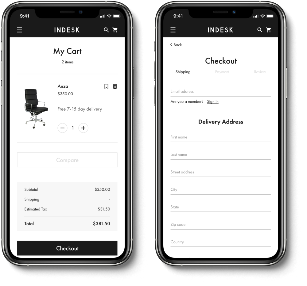
Guest checkout with signing in as a secondary option
Prevents users from being frustrated by the registration page during the checkout process
Effectively increases the rate of capturing email addresses from the customers
Discover Phase
To better study the current trends and successful designs, I conducted a competitive analysis on six different companies.
First I had to come up with a research plan that specifies the objective and methodology of the analysis along with the list of companies that includes both direct and indirect competitors.
Research Questions:
What causes a stressful shopping experience for the users?
What are the common user flows when shopping for chairs or any other furniture?
How do the current services support their users throughout their shopping experience?
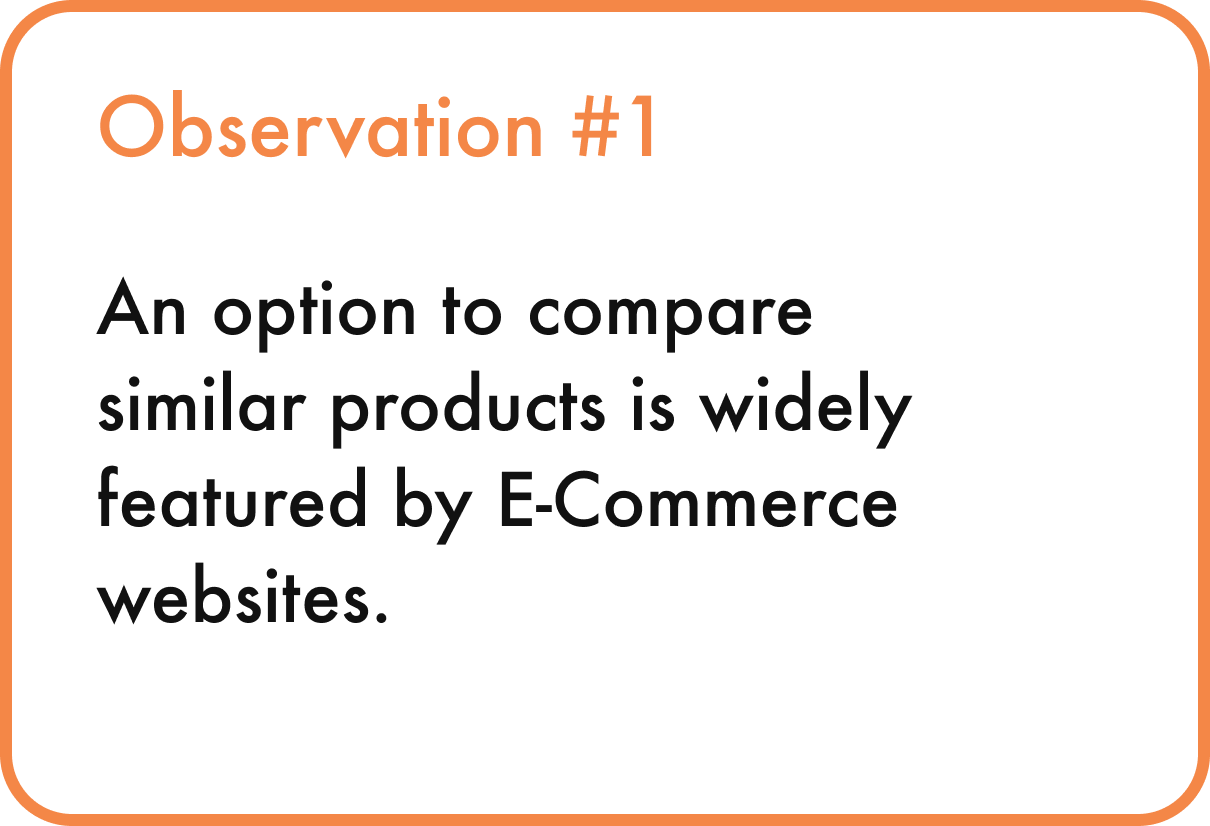
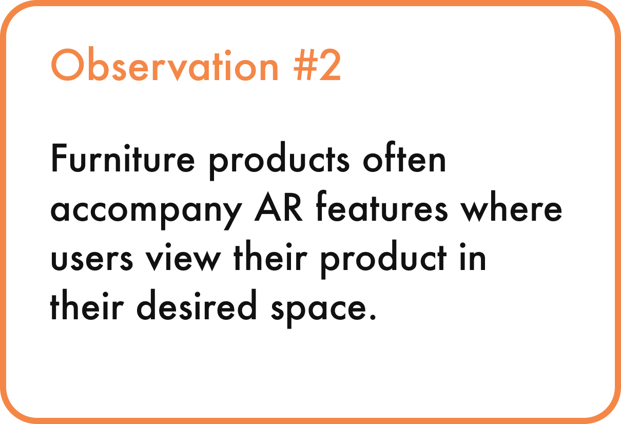
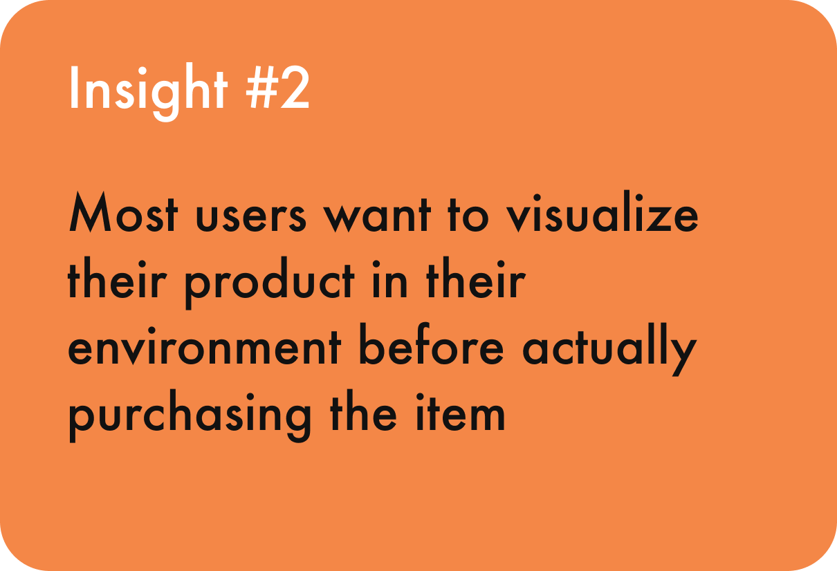
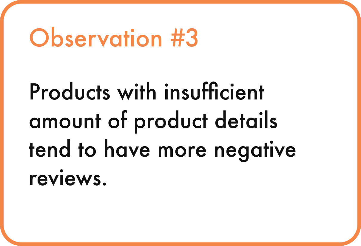
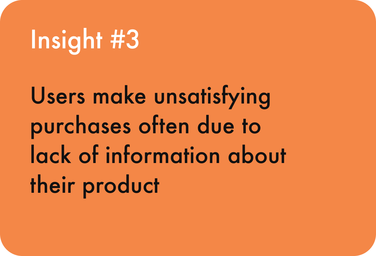
I organized a spreadsheet (utilizing the free template provided by Google) that consists of the findings of the current services based on the critical aspects of the user experiences, such as first impressions, user flows, and accessibility. Then I wrote down some of the most notable observations followed by the insights to help me answer my research questions.
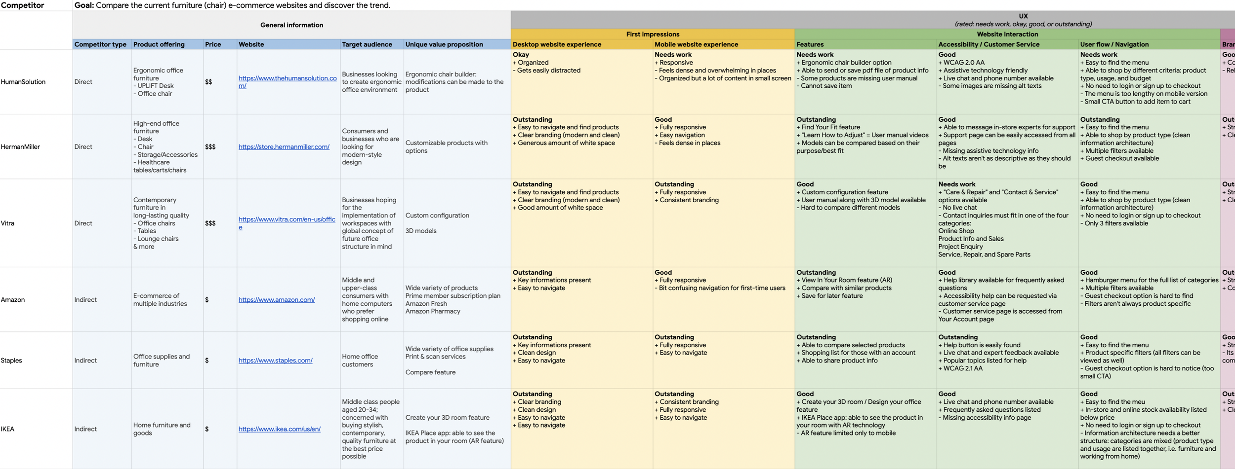
Observations + Insights

Design + Validate Phase
After discovering the existing solutions, I incorporated the most fitting for my scenario, where both the business and user goals could be met.
To visualize how the users would achieve their goals with my design, I decided to create a user flow for the entire conversion process which contains my solutions. The overall flow was further broken down into two specific user flows, with each depicting a single solution.
(Click image to enlarge!)
Following the structure established by my user flows, I designed low-fidelity wireframes that were later tested before I decided to move on to creating high-fidelity screens. The sketching process was deliberately left out only because I believed I already had enough structure planned out through the user flows.
Out of various options to test my design, I chose to conduct an unmoderated usability test for all rounds of testing. An unmoderated usability testing seemed more appropriate for my scenario since it creates a more natural environment for the participants and delivers data at a much faster rate.
Each participant was given three tasks in total (all directly related to both business and user goals) to complete on their own; for each round of testing, I collected the most prominent data and went back to the design phase to make improvements to my designs accordingly.
Major Improvements
01
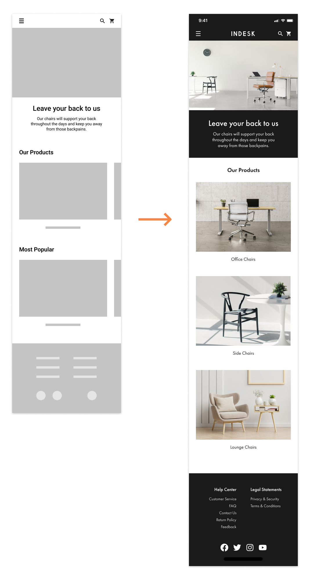
Building better information architecture for home page
I altered the structure of the Our Products section along with the removal of the Most Popular section to keep the page content simpler and more direct, so it could minimize confusion for the users.
Misclick rate dropped from 80% to 29%
Bounce (giving up) rate dropped from 60% to 8% for the first task, which had the home page as the starting screen
02
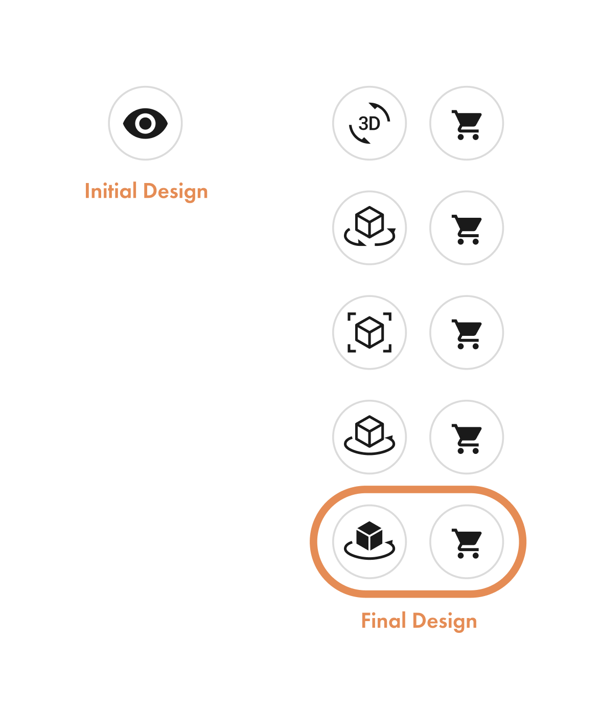
Using appropriate icons for CTA buttons
The initial design for the View In Your Room icon was often misunderstood as for viewing the product detail instead.
I came up with five new icons and aligned them all together with the Add To Cart icon to compare and choose the most fitting one that gives out the correct information to the users.
03
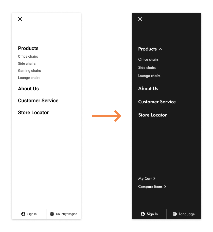
Providing an alternative navigation for My Cart and Compare Items pages
During the first round of usability test, 3 out of 11 users struggled as they were trying to compare their selected items.
According to the heatmaps, those users clicked on the menu first to see if they could find the Compare Items page from there.
Based on this observation, I decided to locate My Cart and Compare Items pages on the menu bar as well, creating an alternate path for the users to navigate themselves.
Success rate for the task went up by about 20%
Final Product
(Click image to enlarge!)
Leaving Thoughts
To sum up this project, I believe it was a great opportunity to test my decision-making skills. Because the main goal of this project was to keep the user and business goals in balance, it was immensely challenging to constantly seek for the most suitable options that wouldn’t compromise either goal.