
BetterPaw
Designing an app that helps not only people but also animals
Duration
Sep 2021 - Feb 2022
Twenty weeks
Project Type
Solo Project
My Role
User Research
Interface Design
Usability Testing
Branding
Overview
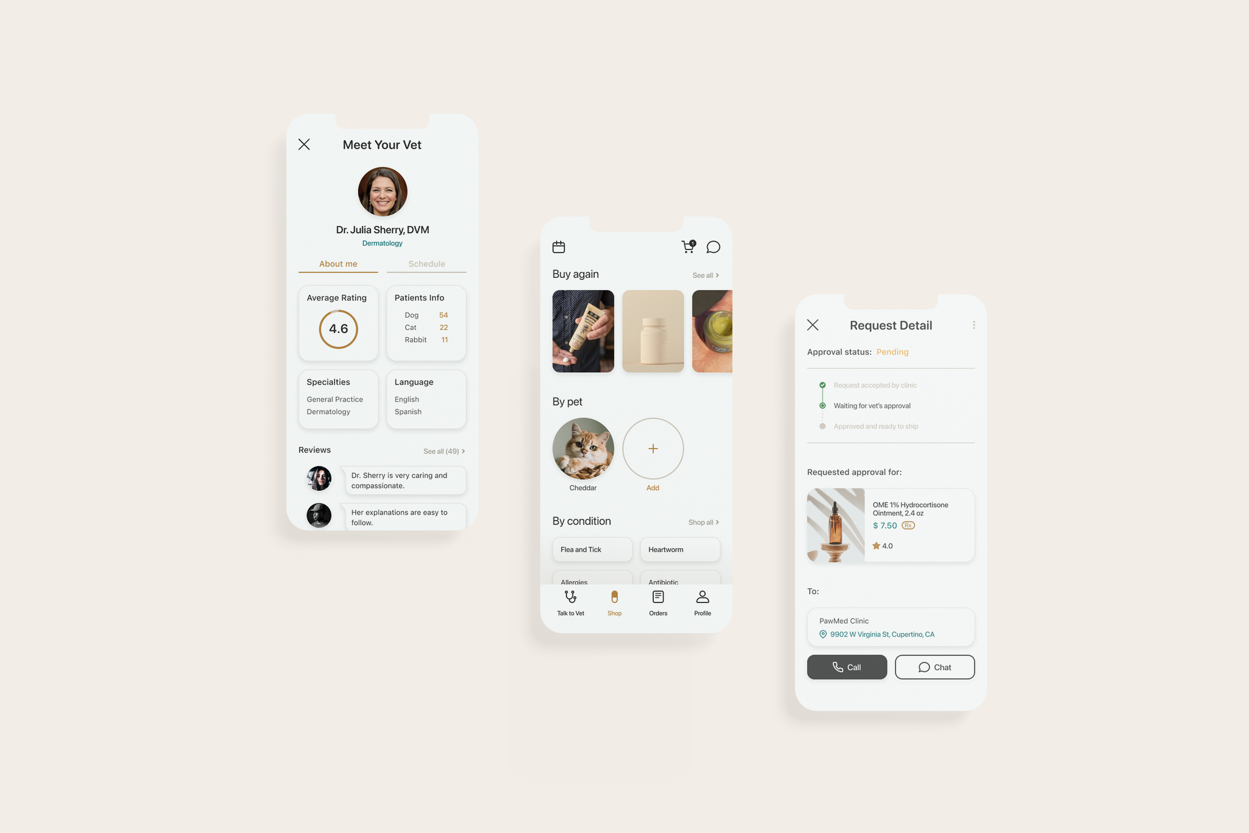
BetterPaw is a mobile app that makes virtual veterinary services more accessible for pet owners and their pets.
The users can ask for advice through a video chat with a licensed veterinarian and even chat directly with their clinic to ask for a prescription approval, without having to visit the clinic in person.
Throughout this project, I got to tackle starting from foundational research and all the way down to building a high-fidelity prototype for the first time, while learning the benefits and shortcomings of each UX method.
Hypothesis
Ordering prescriptions for pets online isn’t as easy as it should be.
When I used to work as a veterinary assistant at a clinic, I noticed that there is always a good amount of pet owners who came all the way to the clinic only to pick up their pet’s medication.
I couldn’t help but wonder: “Why can’t they just order them online and get them delivered instead?”
Then I came up with two different assumptions:
The benefits of pet telemedicine services are too minimal
Current pet telemedicine apps aren’t simple to use for everyone
In hopes of finding the answer to my question, I carried out my own secondary research to see if my assumptions are true or not.
Research + Define
Pet owners choose pet telemedicine services for the benefit of saving time, convenience, and expenses.
According to the journal Preventive Veterinary Medicine, pet owners’ willingness to pay (WTP) for telemedicine attributes has been growing significantly. Over the five years, 991 respondents participated in the survey of WTP for pet telemedicine and listed their reasons for choosing pet telemedicine over in-person visits.

Then what’s preventing the users from enjoying those benefits?
To answer this question and further define the problem, I conducted user interviews through Zoom with 5 current and past pet owners and analyzed the findings through affinity map and empathy maps.
-
To better understand the user’s behavior behind their reasoning for using/not using pet telemedicine services in depth
To obtain qualitative data on current existing pet telemedicine services
-
Identify the individuals who are more likely to access pet telemedicine services
Evaluate the current service and any pain points users are facing
-
First I built a screener survey to narrow down the participant pool and collect valuable responses from the target audience more efficiently
Inclusion criteria:
Past and current pet owners
Those who have purchased prescription products online before
Problem
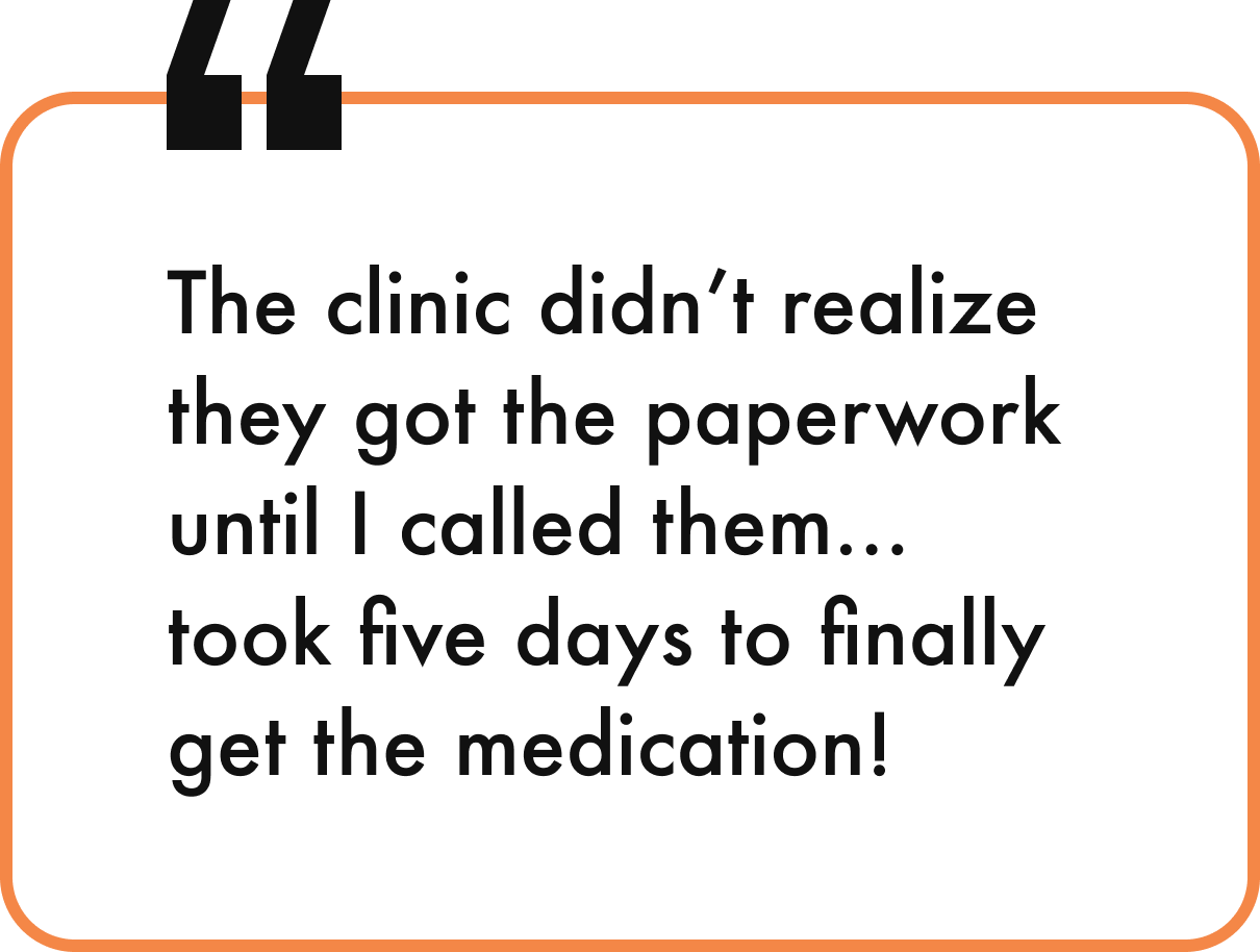
Current pet telemedicine services lack direct communication between a client and a clinic.
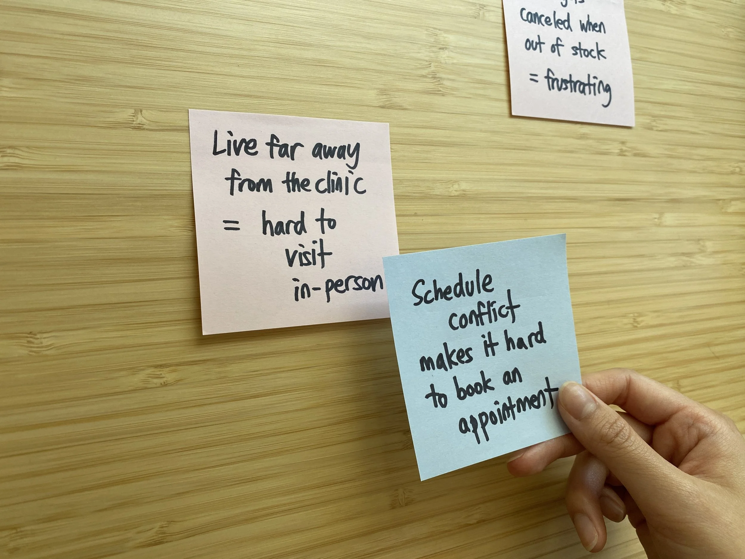
As I organized my affinity map based on user interviews, I noticed three common pain points of the current services that my participants repeatedly mentioned:
Difficult appointment scheduling
Complex prescription approval process with frequent delays
Safety and reliability concerns
Then I realized that those pain points are often led by a communication failure between the users (pet owners) and their clinic.
Solutions
01
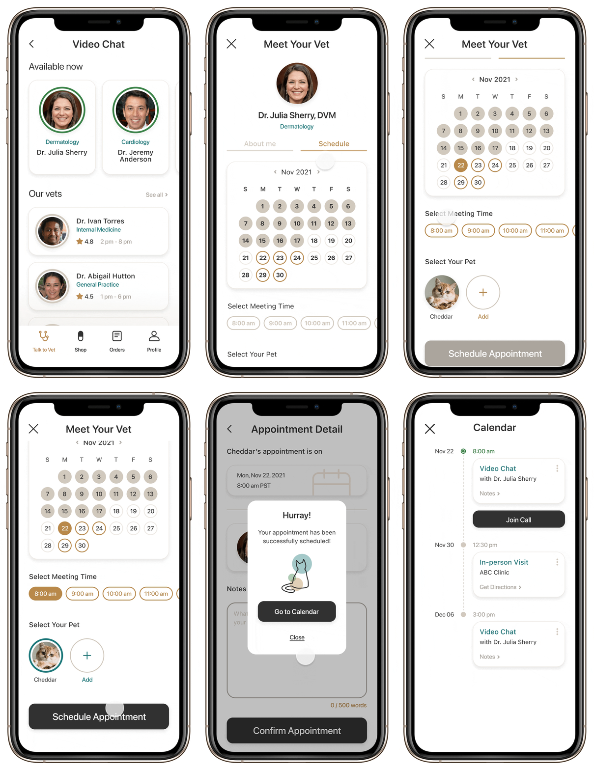
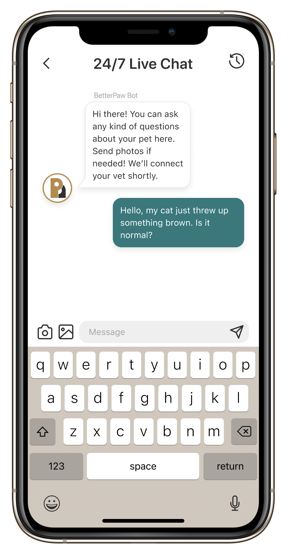
Video chat with a vet for convenient scheduling + 24/7 Live Chat
Allows the users to choose their vet to talk to at their own convenience
24/7 Live Chat for asking quick questions that do not require a full appointment
02
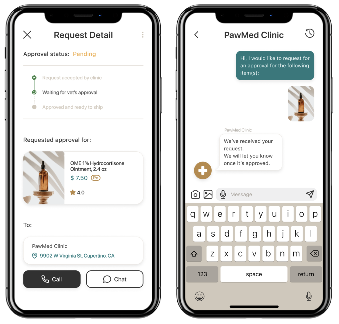
Chatroom between a client and a clinic for better communication
Check the approval status with clinic
Send additional documents through chat if needed
Provides live updates to avoid delays in the process
Persona
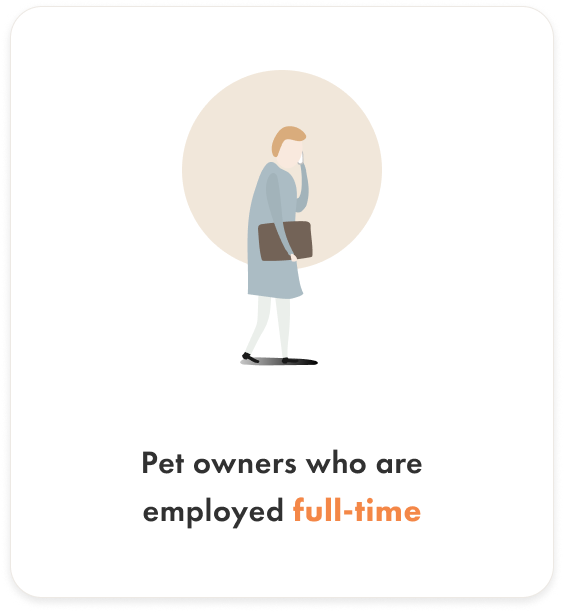
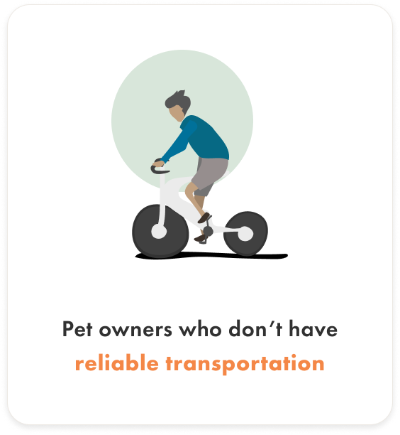
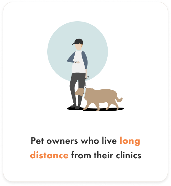
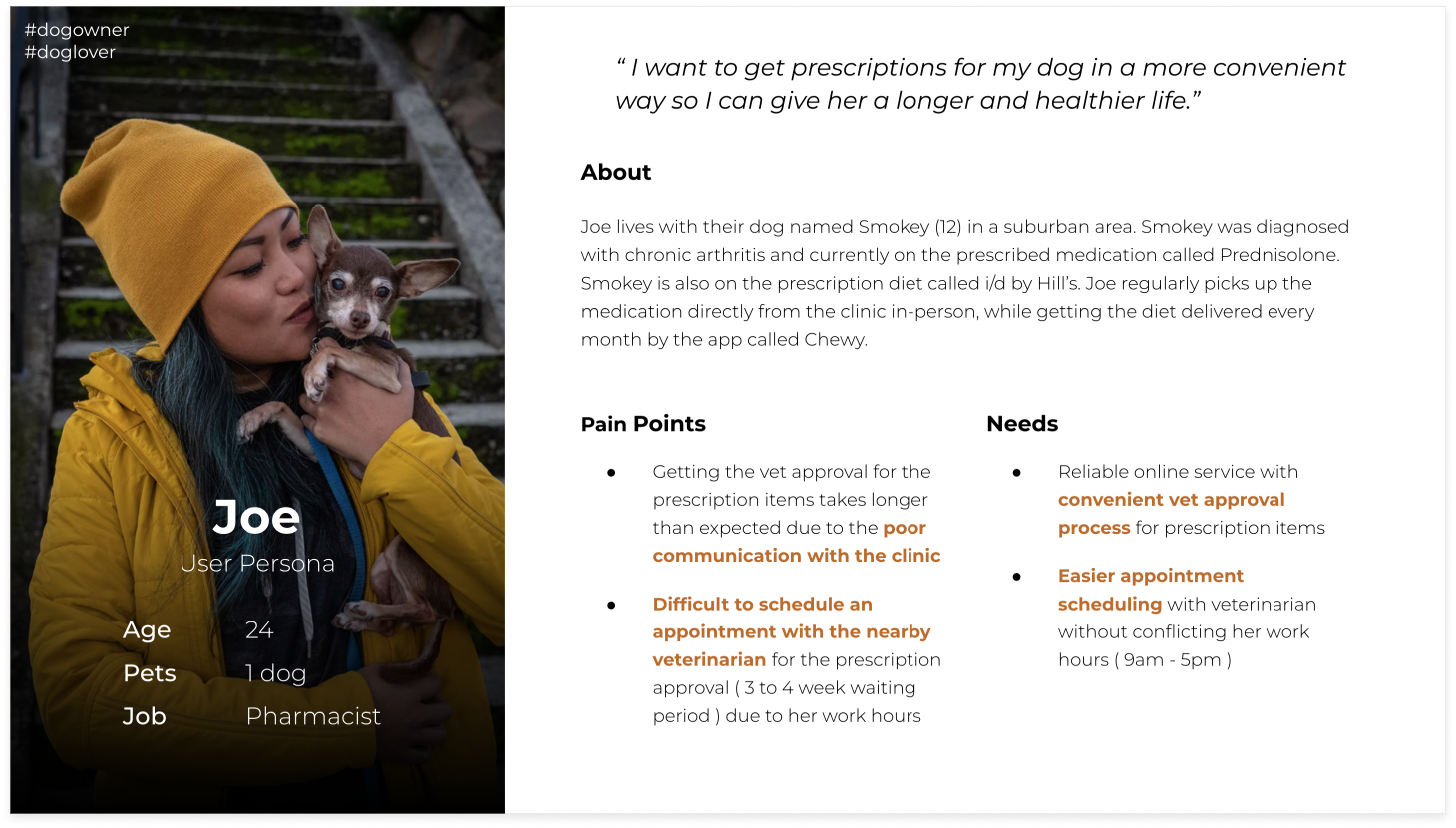
Both my secondary and user research helped me to identify the individuals who are more likely to use pet telemedicine services and detect three distinct characteristics that were repeatedly found among them.
Once I identified those characteristics shown above, I decided to incorporate them into my single persona along with the pain points from the affinity map to set clearer goals for my design.
How Might We
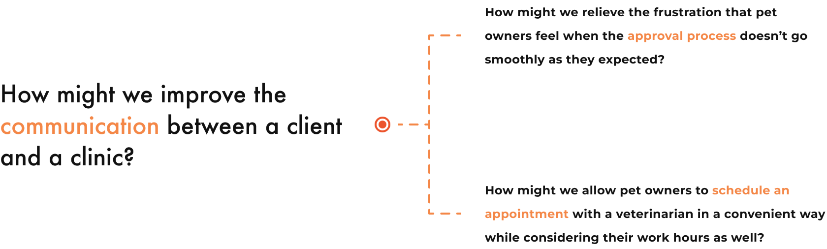
Rather than coming up with solutions right away, I posed some How Might We (HMW) questions so that I could remain focused on the problems.
Once I settled down with one main HMW question, I decided to break it down into more specific ones that could generate ideas without limiting creativity.
Ideate
(Click image to enlarge!)
To establish the overall structure for the app before jumping onto sketch, I decided to create a sitemap based on what the most common tasks the users focus on as they interact with current pet telemedicine services.
Since the user goals are focused on: (1) scheduling an appointment and (2) getting a prescription approval, I created two user flows conveying each objective.
Design + Validate
Every time before moving on to the next level of design (from sketch to wireframe and from wireframe to final design), I performed a usability test with my target audience (n=5) to iterate the design process more efficiently without neglecting any usability issues.
After prioritizing the issues based on their chance of occurrence, I went back to my designs and refined them to resolve the issues.
Major Improvements
01
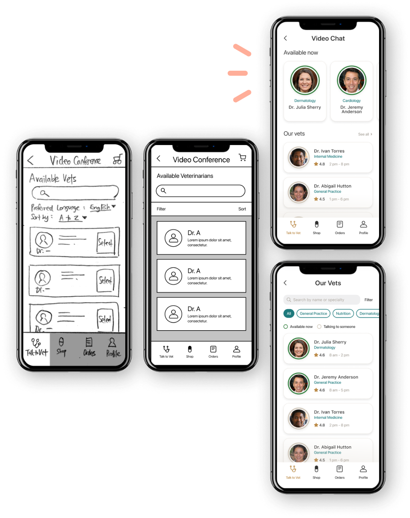
Highlighting veterinarian’s specialty and availability status
Based on the feedback from the low-fidelity prototype usability tests, having additional information to help the user choose a vet appeared to be a better decision.
I also added some visual hierarchy to the list of veterinarians to show who is available at the moment for the user.
02
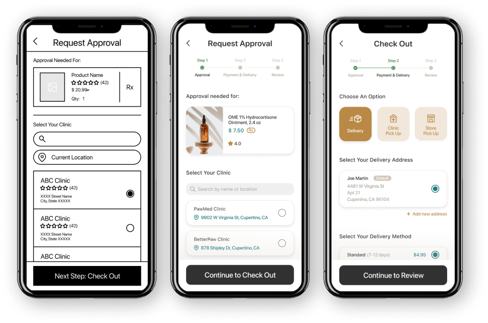
Adding progress bar to show completion of approval request
Throughout the usability tests, I noticed that the majority of the participants (3 out of 5) had a problem figuring out whether the approval request has been placed or not.
Endowed progress effect - motivates the user to move forward with a task
03
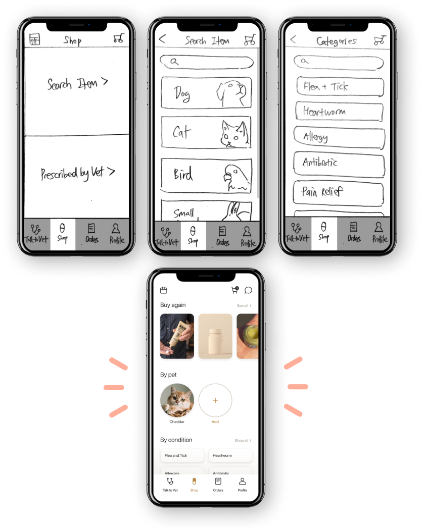
Combining multiple screens into one for more intuitive navigation
The “Shop” menu originally had three separate pages each with different levels of categories.
Most of my users thought it takes too many steps to find their item, so I decided to simplify the process by combining them into one screen.
Style Guide
Final Product
If I had more time…
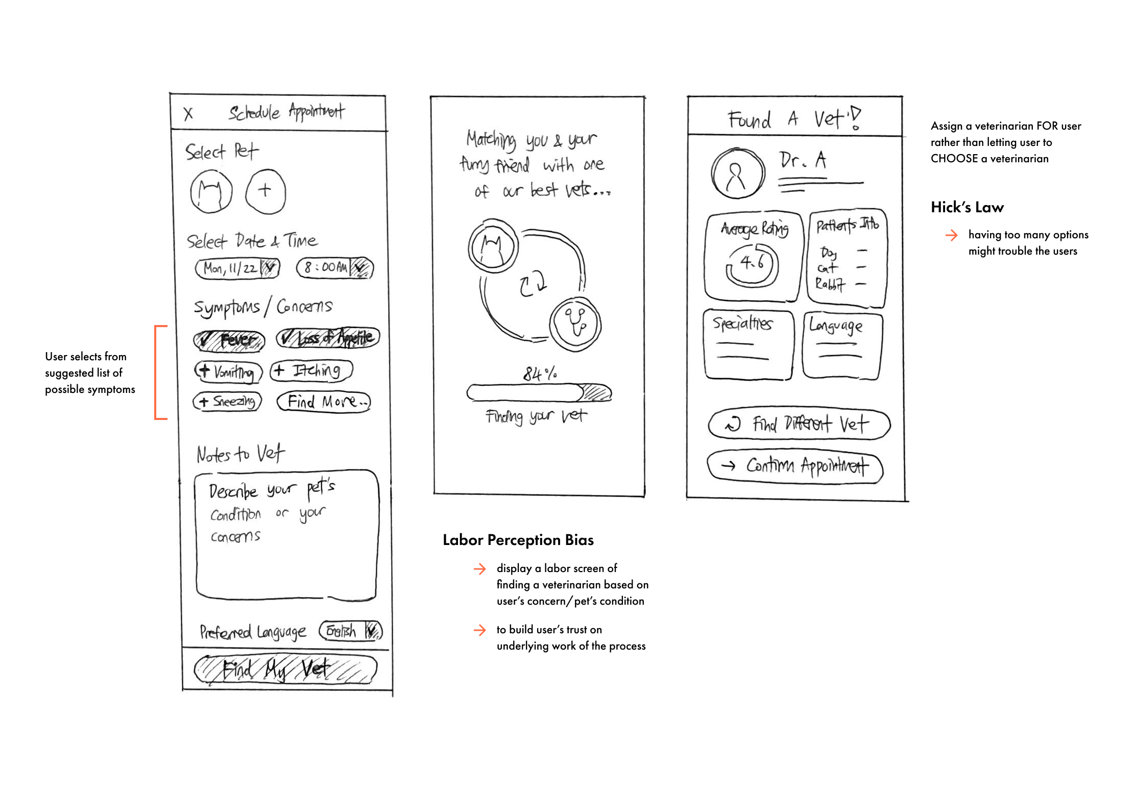
#1 — Test out an alternate solution for the unaddressed issue
As I was working on the red route of the video chat feature, a sudden question came up to my mind:
“What if the user doesn’t know which vet to choose when scheduling a video chat appointment?”
Since I had already moved onto the final part of the design process, I decided to make a quick sketch of an alternate solution — where the user gets ASSIGNED to a veterinarian based on the user’s need and availability instead of choosing on their own — and save it in the project folder in case I might want to redesign this in the future.
#2 — Perform tree testing or card sorting to evaluate the information architecture
Due to the time constraint, I didn’t get a chance to test out the information architecture I built on a sitemap of this product. By conducting either tree testing or card sorting, I’d be able to better understand the user’s behavior by observing how people categorize specific items.
Leaving Thoughts
Now that I’ve reached the end of my very first UX design project (finally), I am grateful that I was able to learn so many valuable lessons throughout this journey. That being said, there are couple things I wish to do better next time:
Focus on what needs to be prioritized.
Throughout my entire design process, I constantly found myself in this cycle of thought: “Is this feature necessary?” or “Should I leave out the details in this part?”
I hope to be more efficient when making decisions to lay out the tasks by communicating with my users, future teammates, and stakeholders.
Know the difference between the facts and assumptions.
As a first-time product designer, there were several moments where I came up with solutions that were heavily based on my assumptions.
To prevent myself from creating a biased design solution that neglects user’s point of view, I constantly reminded myself of this: “Do not let yourself lured into an easy path, choose the right one.”